Client: 100% Pure New Zealand
Service: New Zealand
Target audience: Double income no kids
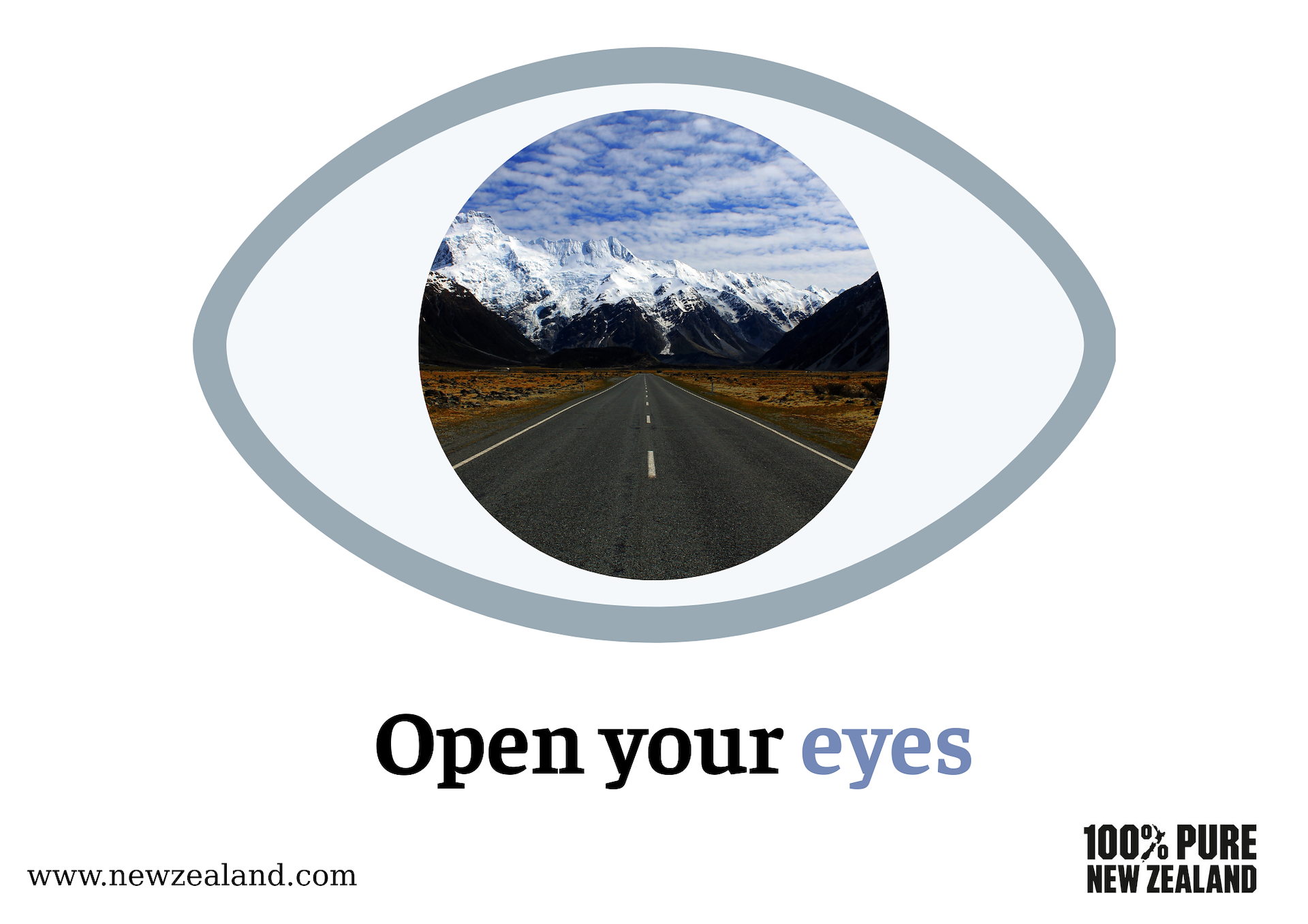
SMP: New Zealand has something for everyone
Mandatories: Logo, URL
Idea: 100% Pure New Zealand can be considered as the Explorer due to its adventurous traits, encouraging the travellers to explore the beauty of nature in New Zealand. The ad effectively communicates the SMP in a short and clear headline. The headline creates a Call-To-Action message, incentivising audiences to visit New Zealand in person to experience the natural landscapes with all their senses. The typography highlights the word "eyes" in blue, symbolising vision and invoking a sense of serenity in nature. The colour and composition are readable.
OOH Billboard